
쉐이더 프로그래밍 언어 중에 하나인 GLSL의 프레그먼트 쉐이더 코드를 블렌더의 쉐이더 노드로 구성하는 내용에 대한 정리입니다. 먼저 GLSL에 대한 코드는 다음과 같습니다.
varying vec2 vUv;

void main() {
  float strength = step(0.01, abs(distance(vUv, vec2(0.5)) - 0.3));
  gl_FragColor = vec4(vec3(strength), 1.0);
}
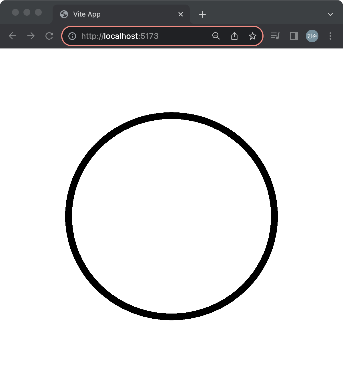
결과는 다음과 같습니다. three.js를 사용했습니다.
위의 쉐이더 코드를 블렌더의 쉐이더 노드로 구성하면 다음과 같습니다.
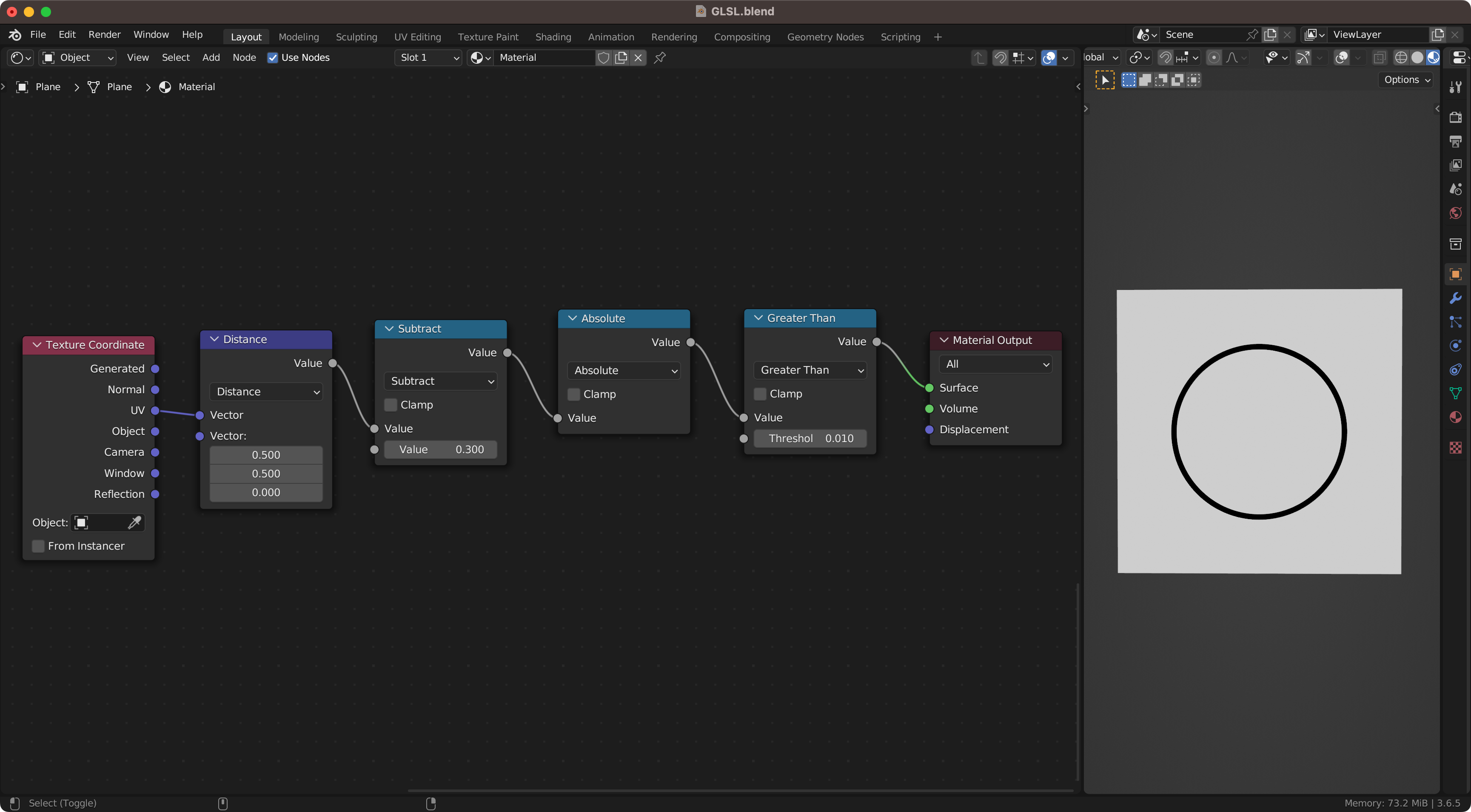
쉐이더의 코드는 블렌더의 쉐이더 노드로 구성할 수 있고, 그 반대로도 가능합니다. 쉐이더 코드는 매우 함축적이고 작은 코드 변화에도 그 결과는 예상하기 어려운 경우가 있습니다. 하지만 블렌더의 쉐이더 노드를 통해 먼저 그 결과를 만들고 이를 다시 쉐이더 코드로 변환한다면 좀 더 나은 개발 접근이 될 수 있습니다.