안드로이드는 뭐 하나 하려면 제법 손이 많이 갑니다.. 스피너에 항목값 리스트를 할당하는 것도 다른 툴에 비해 갑절이나 많은 코드를 작성해야 합니다.
String[] facilityList = {
    "공급배관", "사용자배관", "공급밸브", "정압기", "테스트박스",
    "로케이트박스", "정류기", "배류기", "수취기", "검지공"
};

Spinner spFacilityType = (Spinner)findViewById(R.id.spFacilityType);
ArrayAdapter<string> adapter = new ArrayAdapter<string>(
    this,
    android.R.layout.simple_spinner_dropdown_item,
    facilityList);
spFacilityType.setAdapter(adapter);
spFacilityType.setSelection(0);
그런데 말입니다… 이렇게 해서 만들어진 스피너의 생김새가 다소 촌스럽습니다. 바로 아래처럼…
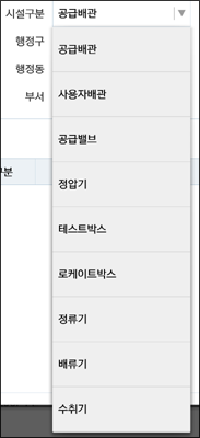
표시되는 항목들의 높이가 너무 높아 보이지 않나요? 이 항목의 높이값을 조절하기 위해 위의 코드 중 9번줄의 코드를 변경했는데 전체 코드를 다시 보면 다음과 같습니다.
String[] facilityList = {
    "공급배관", "사용자배관", "공급밸브", "정압기", "테스트박스",
    "로케이트박스", "정류기", "배류기", "수취기", "검지공"
};

Spinner spFacilityType = (Spinner)findViewById(R.id.spFacilityType);
ArrayAdapter<string> adapter = new ArrayAdapter<string>(
    this,
    R.layout.custom_simple_dropdown_item_1line,
    facilityList);
spFacilityType.setAdapter(adapter);
spFacilityType.setSelection(0);
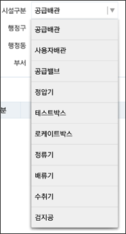
결과는 다음과 같습니다
이를 위해 여기서 추가한 리소스가 하나 있습니다. 바로 custom_simple_dropdown_item_1line.xml인데요. 그 내용은 다음과 같습니다.
이상 맨날 까먹어 고생하는 코드를 정리해 보았습니다.